너비가 있는 CSS 입력: 100%가 상위 경계를 벗어납니다.
패딩이 삽입된 두 개의 입력 필드로 로그인 양식을 만들려고 하는데 부모님의 범위를 초과하게 됩니다.원인이 무엇입니까?
JSFiddle 스니펫: http://jsfiddle.net/4x2KP/
    #mainContainer {
        line-height: 20px;
        font-family: "Helvetica Neue",Helvetica,Arial,sans-serif;
        background-color: rgba(0,50,94,0.2);
        margin: 20px auto;
        display: table;
        -moz-border-radius: 15px;
        border-style: solid;
        border-color: rgb(40, 40, 40);
        border-radius: 2px 5px 2px 5px / 5px 2px 5px 2px;
        border-radius: 2px;
        border-radius: 2px 5px / 5px;
        box-shadow: 0 5px 10px 5px rgba(0,0,0,0.2);
    }

    .loginForm {
        width: 320px;
        height: 250px;
        padding: 10px 15px 25px 15px;
        overflow: hidden;
    }

    .login-fields > .login-bottom input#login-button_normal {
        float: right;
        padding: 2px 25px;
        cursor: pointer;
        margin-left: 10px;
    }

    .login-fields > .login-bottom input#login-remember {
        float: left;
        margin-right: 3px;
    }

    .spacer {
        padding-bottom: 10px;
    }

    /* ELEMENT OF INTEREST HERE! */
    input[type=text],
    input[type=password] {
        width: 100%;
        height: 20px;
        padding: 5px 10px;
        background-color: rgb(215, 215, 215);
        line-height: 20px;
        font-size: 12px;
        color: rgb(136, 136, 136);
        border-radius: 2px 2px 2px 2px;
        border: 1px solid rgb(114, 114, 114);
        box-shadow: 0 1px 0 rgba(24, 24, 24,0.1);
    }

    input[type=text]:hover,
    input[type=password]:hover,
    label:hover ~ input[type=text],
    label:hover ~ input[type=password] {
        background:rgb(242, 242, 242) !important;
    }

    input[type=submit]:hover {
      box-shadow:
        inset 0 1px 0 rgba(255,255,255,0.3),
        inset 0 -10px 10px rgba(255,255,255,0.1);
    }
<div id="mainContainer">
<div id="login" class="loginForm">
<div class="login-top">
</div>
<form class="login-fields" onsubmit="alert('test'); return false;">
<div id="login-email" class="login-field">
<label for="email" style="-moz-user-select: none;-webkit-user-select: none;" onselectstart="return false;">E-mail address</label>
<span><input name="email" id="email" type="text"></input></span>
</div>
<div class="spacer"></div>
<div id="login-password" class="login-field">
<label for="password" style="-moz-user-select: none;-webkit-user-select: none;" onselectstart="return false;">Password</label>
<span><input name="password" id="password" type="password"></input></span>
</div>
<div class="login-bottom">
<input type="checkbox" name="remember" id="login-remember"></input>
<label for="login-remember" style="-moz-user-select: none;-webkit-user-select: none;" onselectstart="return false;">Remember my email</label>
<input type="submit" name="login-button" id="login-button_normal" style="cursor: pointer" value="Log in"></input>
</div>
</form>
</div>
</div>CSS 기본 상자 모델에 따라 요소의 너비와 높이가 내용 상자에 적용됩니다.패딩은 해당 내용 상자 밖으로 나와 요소의 전체 크기를 늘립니다.
따라서 패딩을 사용하여 요소의 너비를 100%로 설정하면 해당 요소의 패딩은 포함 요소의 너비를 100%보다 넓힙니다.당신의 맥락에서, 입력은 부모보다 더 넓어집니다.
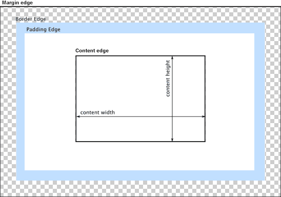
상자 모델이 패딩과 너비를 처리하는 방법을 변경할 수 있습니다.CSS 속성을 다음으로 설정합니다.border-box패딩이 요소의 너비 또는 높이에 영향을 미치지 않도록 하려면:
border-box : 너비 및 높이 속성에는 패딩과 테두리가 포함되지만 여백은 포함되지 않습니다...패딩과 테두리는 상자 안에 있습니다.
(IE8+)의 브라우저 호환성을 확인합니다.
이 편집 시점에는 접두사가 필요하지 않습니다.
Paul Irish와 Chris Coyier는 아래의 "상속된" 사용을 권장합니다.
html {
  box-sizing: border-box;
}
*, *:before, *:after {
  box-sizing: inherit;
}
자세한 내용은 다음을 참조하십시오.
: } { 박스크기상 : } FTW
박스 크기를 상속하는 것이 아마도 약간 더 나은 모범 사례일 것입니다.
다음은 귀사의 구체적인 상황에 대한 데모입니다.
#mainContainer {
  line-height: 20px;
  font-family: "Helvetica Neue", Helvetica, Arial, sans-serif;
  background-color: rgba(0, 50, 94, 0.2);
  margin: 20px auto;
  display: table;
  -moz-border-radius: 15px;
  border-style: solid;
  border-color: rgb(40, 40, 40);
  border-radius: 2px 5px 2px 5px / 5px 2px 5px 2px;
  border-radius: 2px;
  border-radius: 2px 5px / 5px;
  box-shadow: 0 5px 10px 5px rgba(0, 0, 0, 0.2);
}
.loginForm {
  width: 320px;
  height: 250px;
  padding: 10px 15px 25px 15px;
  overflow: hidden;
}
.login-fields > .login-bottom input#login-button_normal {
  float: right;
  padding: 2px 25px;
  cursor: pointer;
  margin-left: 10px;
}
.login-fields > .login-bottom input#login-remember {
  float: left;
  margin-right: 3px;
}
.spacer {
  padding-bottom: 10px;
}
input[type=text],
input[type=password] {
  width: 100%;
  height: 30px;
  padding: 5px 10px;
  background-color: rgb(215, 215, 215);
  line-height: 20px;
  font-size: 12px;
  color: rgb(136, 136, 136);
  border-radius: 2px 2px 2px 2px;
  border: 1px solid rgb(114, 114, 114);
  box-shadow: 0 1px 0 rgba(24, 24, 24, 0.1);
  box-sizing: border-box;
}
input[type=text]:hover,
input[type=password]:hover,
label:hover ~ input[type=text],
label:hover ~ input[type=password] {
  background: rgb(242, 242, 242);
  !important;
}
input[type=submit]:hover {
  box-shadow: inset 0 1px 0 rgba(255, 255, 255, 0.3), inset 0 -10px 10px rgba(255, 255, 255, 0.1);
}
.login-top {
  height: auto;/*85px;*/
}
.login-bottom {
  padding: 35px 15px 0 0;
}
<div id="mainContainer">
<div id="login" class="loginForm">
<div class="login-top">
</div>
<form class="login-fields" onsubmit="alert('test'); return false;">
<div id="login-email" class="login-field">
<label for="email" style="-moz-user-select: none;-webkit-user-select: none;" onselectstart="return false;">E-mail address</label>
<span><input name="email" id="email" type="text" /></span>
</div>
<div class="spacer"></div>
<div id="login-password" class="login-field">
<label for="password" style="-moz-user-select: none;-webkit-user-select: none;" onselectstart="return false;">Password</label>
<span><input name="password" id="password" type="password" /></span>
</div>
<div class="login-bottom">
<input type="checkbox" name="remember" id="login-remember" />
<label for="login-remember" style="-moz-user-select: none;-webkit-user-select: none;" onselectstart="return false;">Remember my email</label>
<input type="submit" name="login-button" id="login-button_normal" style="cursor: pointer" value="Log in" />
</div>
</form>
</div>
</div>는패딩추대신는하에 보다.<input>자체에 합니다.<span>요소가 입력을 감싼다.그런식으로식▁that로으.<input>요소를 다음으로 설정할 수 있습니다.width:100%추가 패딩의 영향을 받지 않습니다.아래의 예:
#login-form {
  font-family: "Helvetica Neue", Helvetica, Arial, sans-serif;
  background-color: rgba(0, 50, 94, 0.2);
  margin: 20px auto;
  padding: 10px 15px 25px 15px;
  border: 4px solid rgb(40, 40, 40);
  box-shadow: 0 5px 10px 5px rgba(0, 0, 0, 0.2);
  border-radius: 2px;
  width: 320px;
}
label span {
  display: block;
  padding: .3em 1em;
  background-color: rgb(215, 215, 215);
  border-radius: .25em;
  border: 1px solid rgb(114, 114, 114);
  box-shadow: 0 1px 0 rgba(24, 24, 24, 0.1);
  margin: 0 0 1em;
}
label span:hover {
  background: rgb(242, 242, 242);
  box-shadow: inset 0 1px 0 rgba(255, 255, 255, 0.3), inset 0 -10px 10px rgba(255, 255, 255, 0.1);
}
input[type=text],
input[type=password] {
  background: none;
  border: none;
  width: 100%;
  height: 2em;
  line-height: 2em;
  font-size: 12px;
  color: rgb(136, 136, 136);
  outline: none;
}
.login-bottom {
  margin: 2em 1em 0 0;
}
input#login-button {
  float: right;
  padding: 2px 25px;
}
input#login-remember {
  float: left;
  margin-right: 3px;
}
<form id="login-form">
<label>E-mail address
<span><input name="email" type="text" /></span>
</label>
<label>Password
<span><input name="password" type="password" /></span>
</label>
<div class="login-bottom">
<label>
<input type="checkbox" name="remember" id="login-remember" />Remember my email
</label>
<input type="submit" name="login-button" id="login-button" value="Log in" />
</div>
</form>다른 답변은 너비를 하드 코딩하거나 브라우저별 해킹을 사용하라는 것입니다.저는 더 간단한 방법이 있다고 생각합니다.
너비를 계산하고 필드 오버랩의 원인이 되는 패딩을 차감합니다.20px는 왼쪽 패딩은 10px, 오른쪽 패딩은 10px부터 나옵니다.
input[type=text],
input[type=password] {
    ...
    width: calc(100% - 20px);
}
위의 모든 것이 실패할 경우 입력에 대해 다음 속성을 설정하여 최대 공간을 차지하되 오버플로가 발생하지 않도록 합니다.
input {
    min-width: 100%;
    max-width: 100%;
}
변경해 보십시오.box-sizingborder-box.padding.width의 신의의input요소들.
CSS
input[type=text],
input[type=password] {
    width: 100%;
    margin-top: 5px;
    height: 25px;
    ...
}

input {
    box-sizing: border-box;
}
이것을 코드화해 보세요.
*, ::after, ::before {
  box-sizing: border-box;
}
전체 너비에 패딩이 추가됩니다.용기에 픽셀 너비가 있으므로 입력에 픽셀 너비를 지정하는 것이 좋지만 동일한 문제를 방지하기 위해 설정한 너비에서 패딩과 테두리를 제거해야 합니다.
이것은 까다롭고 상황적입니다.이러한 의견에 약간의 혼란이 있습니다. 솔루션을 요약해 보겠습니다.
- 첫 번째 유효한 접근법은 승인된 답변에서 showdev에 의해 설명됩니다.그러나, 이것은 최종적인 것이 아닙니다.
사실, 입력에 패딩을 추가하면 이제 작동합니다.마진을 조금 더해도 여전히 넘칩니다.상자 크기가 무시되는 것 같습니다.또한 최소 너비와 최대 너비를 만지작거리는 것도 소용이 없습니다.
마진을 적용하기 위해, 유일하게 작동하는 솔루션은 Al Zziwa에 의해 설명되며, 마진의 양만큼 폭을 줄이기 위해 calc()를 사용합니다.예를 들어, 왼쪽과 오른쪽에 여백 추가:
 input {
     margin: 0 20px;
     width: calc(100% - 40px);
 }
이 솔루션이 마음에 들지 않는 경우 해결 방법은 입력의 여백을 피하는 대신 패딩이나 여백을 적용하는 래퍼를 사용하는 것입니다.
다음 줄에 느낌표가 있는 CSS에도 오류가 있습니다.
background:rgb(242, 242, 242);!important;
앞에 있는 세미클램프를 제거합니다.그러나 !important는 거의 사용하지 않아야 하며 대부분 피할 수 있습니다.
저는 이러한 해결책들을 시도해 보았지만 결코 결정적인 결과를 얻지 못했습니다.결국 저는 필드 세트와 함께 적절한 시맨틱 마크업을 사용했습니다.너비 계산과 상자 크기를 추가해야 하는 비용을 절약할 수 있었습니다.
또한 필요에 따라 양식 너비를 설정할 수 있으며 입력은 가장자리에 필요한 패딩 내에 유지됩니다.
이 예에서는 양식 및 필드 집합에 테두리를 두었고 범례 및 필드 집합에 불투명 배경을 두어 서로 겹치는 방식을 볼 수 있습니다.
<html>
  <head>
  <style>
    form {
      width: 300px;
      margin: 0 auto;
      border: 1px solid;
    }
    fieldset {
      border: 0;
      margin: 0;
      padding: 0 20px 10px;
      border: 1px solid blue;
      background: rgba(0,0,0,.2);
    }
    legend {
      background: rgba(0,0,0,.2);
      width: 100%;
      margin: 0 -20px;
      padding: 2px 20px;
      color: $col1;
      border: 0;
    }
    input[type="email"],
    input[type="password"],
    button {
      width: 100%;
      margin: 0 0 10px;
      padding: 0 10px;
    }
    input[type="email"],
    input[type="password"] {
      line-height: 22px;
      font-size: 16px;
    }
    button {
    line-height: 26px;
    font-size: 20px;
    }
  </style>
  </head>
  <body>
  <form>
      <fieldset>
          <legend>Log in</legend>
          <p>You may need some content here, a message?</p>
          <input type="email" id="email" name="email" placeholder="Email" value=""/>
          <input type="password" id="password" name="password" placeholder="password" value=""/>
          <button type="submit">Login</button>
      </fieldset>
  </form>
  </body>
</html>
에서 div. .parent { height: fit-content; }
문제 코드가 아니더라도 누군가에게 도움이 될 수도 있는 경우를 대비해 남겨두지만 문제 주제 자체와 관련이 있을 수 있다고 생각합니다.
CSS 그리드 스타일의 양식을 사용하는 중에 실수로 입력이 넘쳐났습니다.
솔루션은 다음을 추가하는 것이었습니다.
grid-template-columns: 100%
auto값이 오버플로의 원인입니다.
패딩은 기본적으로 폭에 추가됩니다, 그러므로 당신이 말할 때.width:100%그리고.padding: 5px 10px당신은 실제로 100% 너비에 20인치를 더하는 것입니다.
입력 필드의 중심을 맞추시겠습니까?중심 요소에 대한 트릭: 요소의 너비를 지정하고 여백을 자동으로 설정합니다(예:
margin : 0px auto;
width:300px
업데이트된 피들에 대한 링크:
언급URL : https://stackoverflow.com/questions/16907518/css-input-with-width-100-goes-outside-parents-bound
'programing' 카테고리의 다른 글
| app.all('*')과 app.use('/')의 차이 (0) | 2023.08.01 |
|---|---|
| 드롭다운 목록(요소 선택)에서 기본 화살표 아이콘을 제거하는 방법은 무엇입니까? (0) | 2023.08.01 |
| 코드백에서 자바스크립트 함수를 호출하는 방법 (0) | 2023.08.01 |
| Oracle ORA-04068의 빈번한 오류: 기존 패키지 상태가 삭제되었습니다. (0) | 2023.07.27 |
| Thymeleaf에서 의 인스턴스 사용 (0) | 2023.07.27 |